
Imagine a fast-paced hospital ward or a busy community pharmacy. A clinician reaches for a vial of predniSONE, but in a split second of fatigue, they grab predniSOLONE instead. They look almost identical on a label. This isn't just a typo; it's a potentially dangerous dispensing error. When drugs have names that look or sound nearly the same-what we call Look-Alike, Sound-Alike (LASA) medications-the risk of a mix-up skyrockets.
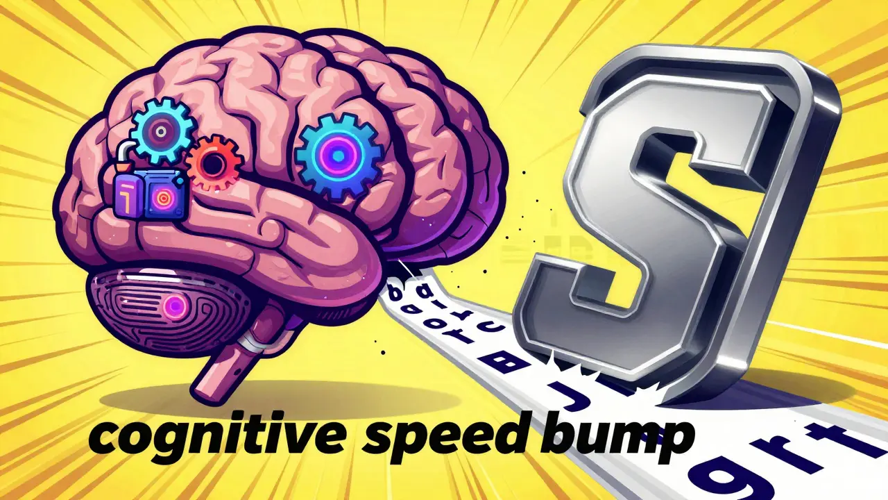
That's where Tall-Man Lettering is a typographic technique that uses selective uppercase letters within a drug name to highlight the differences between similar medications. By breaking the visual monotony of a lowercase word, it creates a "speed bump" for the brain, forcing the reader to notice the distinction before they dispense or administer the drug.
The Basics of LASA Medications
To understand why we need this technique, we have to look at the problem: LASA medications. These are drugs that are easily confused because their names are orthographically similar. For example, vinBLAStine and vinCRIStine are different chemicals, but in a standard font, the difference is subtle. According to research from the Institute for Safe Medication Practices (ISMP), name confusion contributes to roughly one medication error for every 1,000 orders filled in some pharmacy settings.
The goal isn't to make the word look "weird" for the sake of it, but to provide a visual cue that reduces cognitive load. When you're working a 12-hour shift in an emergency department, your brain looks for patterns. Tall-man lettering disrupts the wrong pattern and highlights the right one.
How to Implement Tall-Man Lettering Effectively
You can't just capitalize random letters; there's a science to where the "tall" letters go. The U.S. Food and Drug Administration (FDA) generally recommends capitalizing dissimilar letters starting from the left side of the name. This ensures the eye catches the difference as early as possible when reading from left to right.
If you are setting up this system in your facility, follow these practical steps based on successful hospital protocols:
- Form a Working Group: Don't do this in a vacuum. Bring together pharmacists, IT specialists, and nursing leads. It usually takes a few weeks to get the right stakeholders aligned.
- Select Your Drug List: Don't try to capitalize every drug. Use established lists. The FDA provides a list of recommended pairs, while the ISMP maintains a more extensive list of over 250 pairs.
- Audit Your Systems: Identify every touchpoint where the drug name appears. This includes electronic health records (EHR), automated dispensing cabinets (like Pyxis or Omnicell), and physical prescription labels.
- Standardize the Format: Ensure the font allows the uppercase letters to be distinct without becoming illegible. If the font is too small or too condensed, the "tall" effect is lost.
- Monitor and Update: New drugs enter the market constantly. Set a quarterly review date to add new LASA pairs to your system.
Comparing Regulatory Standards
Depending on where you practice, you might see different capitalization patterns. While the goal is the same, the FDA, ISMP, and Australian health authorities don't always agree on which letters to capitalize.
| Feature | FDA (USA) | ISMP (Global/USA) | National Mixed-Case List (Australia) |
|---|---|---|---|
| Primary Focus | Established drug names | Broad safety initiatives | National standardization |
| List Size | ~72 specific pairs | ~252 drug pairs | ~192 drug pairs |
| Update Frequency | Quarterly/As needed | Quarterly | Periodic revisions |
| Methodology | Postmarketing reports | Clinical incident data | Reported near-misses |
Does it Actually Work? The Evidence
You might wonder if changing a few letters is enough to stop a medical error. The evidence is a bit of a mixed bag, but the general consensus is that it helps when used as part of a larger strategy. An ISMP eye-tracking study showed a 35% reduction in selection errors in simulated scenarios. Real-world feedback supports this; some pharmacists have reported a 42% drop in overridden alerts for LASA drugs after integrating the system into their software.
However, it's not a magic bullet. Some studies, including a long-term review of children's hospitals, found that tall-man lettering alone didn't significantly slash error rates. Why? Because humans are adaptable. Over time, we might stop "seeing" the capital letters, or we might be too distracted by a chaotic environment to notice them.
This is why experts, including those from the American Society of Health-System Pharmacists (ASHP), argue that it's a "necessary but insufficient" tool. It works best when paired with barcode scanning and independent double-checks.
Common Pitfalls and How to Avoid Them
The biggest danger with tall-man lettering is inconsistency. If your pharmacy software says HYDROcodone but your dispensing machine says hydrOCodone, you've just created a new type of confusion. This "system clash" can actually increase the cognitive load on the provider.
Another issue is font size. If the text is tiny, the difference between 'o' and 'O' is negligible. Ensure your digital interfaces use high-contrast, legible fonts. Also, be aware that this technique is less effective for drugs that sound similar but are spelled very differently, or drugs that share the exact same first several syllables (like metoprolol and methyldopa), where the critical difference happens too late in the word to stop a quick-twitch error.

The Future of Medication Differentiation
We are moving toward a world where AI might do the heavy lifting. Some systems are now piloting AI-enhanced lettering that dynamically changes capitalization based on real-time error data. If a specific drug is being mixed up frequently in a specific ward, the AI makes the differentiation more prominent.
While voice recognition and universal barcode scanning will eventually reduce the need for manual reading, the visual safeguard of tall-man lettering will likely remain. It serves as a final, human-readable check in a world of automated systems.
What is the main purpose of tall-man lettering?
The primary goal is to reduce medication errors by visually differentiating "look-alike, sound-alike" (LASA) drug names. By using selective capitalization, it alerts the healthcare provider to the specific parts of the drug name that differ, preventing the wrong medication from being selected or dispensed.
Who decides which letters are capitalized?
Guidelines are typically set by regulatory bodies and safety organizations. In the US, the FDA and the Institute for Safe Medication Practices (ISMP) provide the most widely used lists. Other countries, like Australia, have their own National Mixed-Case Lettering Lists to ensure regional standardization.
Can tall-man lettering completely stop dispensing errors?
No, it is not a complete solution. It is one layer of a "defense-in-depth" strategy. To truly minimize errors, it must be used alongside other safety measures such as barcode medication administration (BCMA), independent double-checks, and electronic prescribing forcing functions.
How long does it take to implement this in a hospital?
Based on industry benchmarks, a full implementation in a mid-to-large hospital can take around 16 weeks. This includes forming a working group, auditing IT systems, and executing the changes across EHRs and dispensing cabinets.
What are some examples of tall-man lettering in action?
Common examples include differentiating predniSONE from predniSOLONE, vinBLAStine from vinCRIStine, and HYDROmorphone from morphINE. The uppercase letters highlight the specific syllables that distinguish the two different medications.
Next Steps for Pharmacy Managers
If you're managing a pharmacy and want to tighten your safety protocols, start with a gap analysis. Compare your current drug labels against the latest ISMP list. If you find discrepancies, don't just change the labels-coordinate with your IT vendor to ensure the change is mirrored in your software. For those in high-stress environments like the ER or ICU, prioritize the most critical high-alert medications first to get the fastest safety return on your investment.

Trey Kauffman
April 12, 2026 AT 05:09Oh, absolutely. Because clearly, the pinnacle of human evolution is training our brains to be tricked by a few capital letters so we don't accidentally kill someone. Truly a masterpiece of systemic failure that we need "speed bumps" for reading basic labels. I'm sure the 12-hour shift fatigue is just a state of mind, right?
Robin Walton
April 13, 2026 AT 21:33It's really heartening to see more focus on these safety layers. Working in healthcare is so draining and it's easy to overlook things when you're exhausted, so anything that helps a tired clinician feel more confident is a win.
Ben hogan
April 13, 2026 AT 23:37Imagine thinking that changing the case of a letter is a revolutionary safety measure. It's a pathetic band-aid for a crumbling infrastructure. If the staff can't distinguish between two different chemicals, maybe the problem isn't the font, but the utter lack of competence in the hiring process. But sure, let's just make the letters taller and call it progress.
Kelly DeVries
April 14, 2026 AT 06:16honestly this is such a mood just imagine the chaos if the it guy messes up the capitals lol it would be a total disaster and we all know some systems are just built to fail anyway
Chad Miller
April 15, 2026 AT 04:28standardiztion is a joke when managment doesnt care about actual safety just checking boxes for the fda
Suchita Jain
April 16, 2026 AT 11:50It is quite disconcerting that the primary responsibility for patient safety is relegated to typographic tricks. One must wonder why the professional standards of pharmaceutical naming are so deficient that such primitive measures are required to prevent catastrophe. It is a reflection of a deeply flawed system.
Simon Stockdale
April 18, 2026 AT 11:42Man the US pharma system is just wild but hey at least we got the best tech in the world even if the labels look like someone sneezed on the keyboard and now we gotta have a whole working group just to decide which letters are big enough to save us from our own stupdidity its just typical red tape everywhere
Thabo Leshoro
April 19, 2026 AT 19:56This is a very good point... especially regarding the LASA risks... My experience with BCMA has been positive... but the visual cue helps a lot... truly it does...
Julie Bella
April 21, 2026 AT 17:34Omg I once saw a nurse almost give the wrong drug and it was SO scary!! 😱 We need way more than just letters! Why aren't we doing a full audit of every single ward every month? It's just basic morality to protect the patients!! 💉✨
emmanuel okafor
April 21, 2026 AT 17:49we just want everyone to be safe in the end and these little changes help people work together better without too much stress
Lynn Bowen
April 22, 2026 AT 13:59It is interesting to see how different countries like Australia handle this compared to the US. The variation in lists shows that safety is often a regional conversation as much as a global one.